Ruben Cespedes
Menu

TL;DR
Problem: Customers couldn't complete basic account tasks on mobile, driving unnecessary call-center volume and eroding satisfaction. What I did: Redesigned the self-service mobile app with simplified workflows built around the most frequent, high-friction tasks. Outcome: 10K+ downloads at launch with a measurable reduction in support contacts for redesigned task flows.
Role & Scope
I led the design of the mobile app experience from concept through delivery, shaping flows, interactions, and visual direction. I partnered with product, engineering, and stakeholders to balance user goals with platform constraints and business priorities.
Context & Problem
Customers relied on the mobile app for essential tasks like billing, account management, and support. The existing experience made it difficult to complete these actions quickly, leading to frustration, increased support requests, and low confidence in self-service.
The challenge was to redesign the app around real user behavior while maintaining reliability and performance.
Constraints
Mobile-first environment with limited screen space
Users with a wide range of technical comfort levels
Legacy backend systems shaping available functionality
High expectations for reliability in everyday use

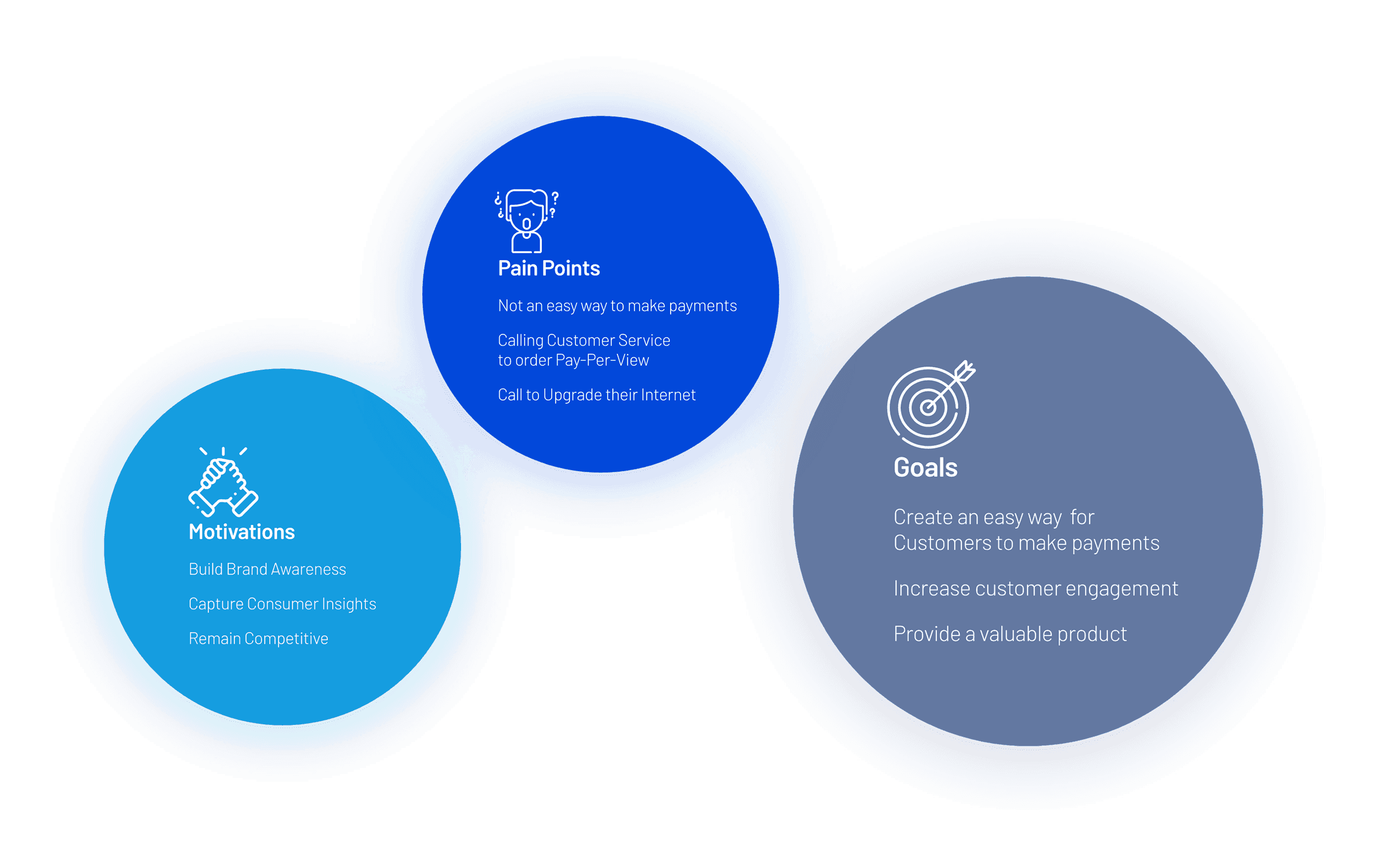
Insights
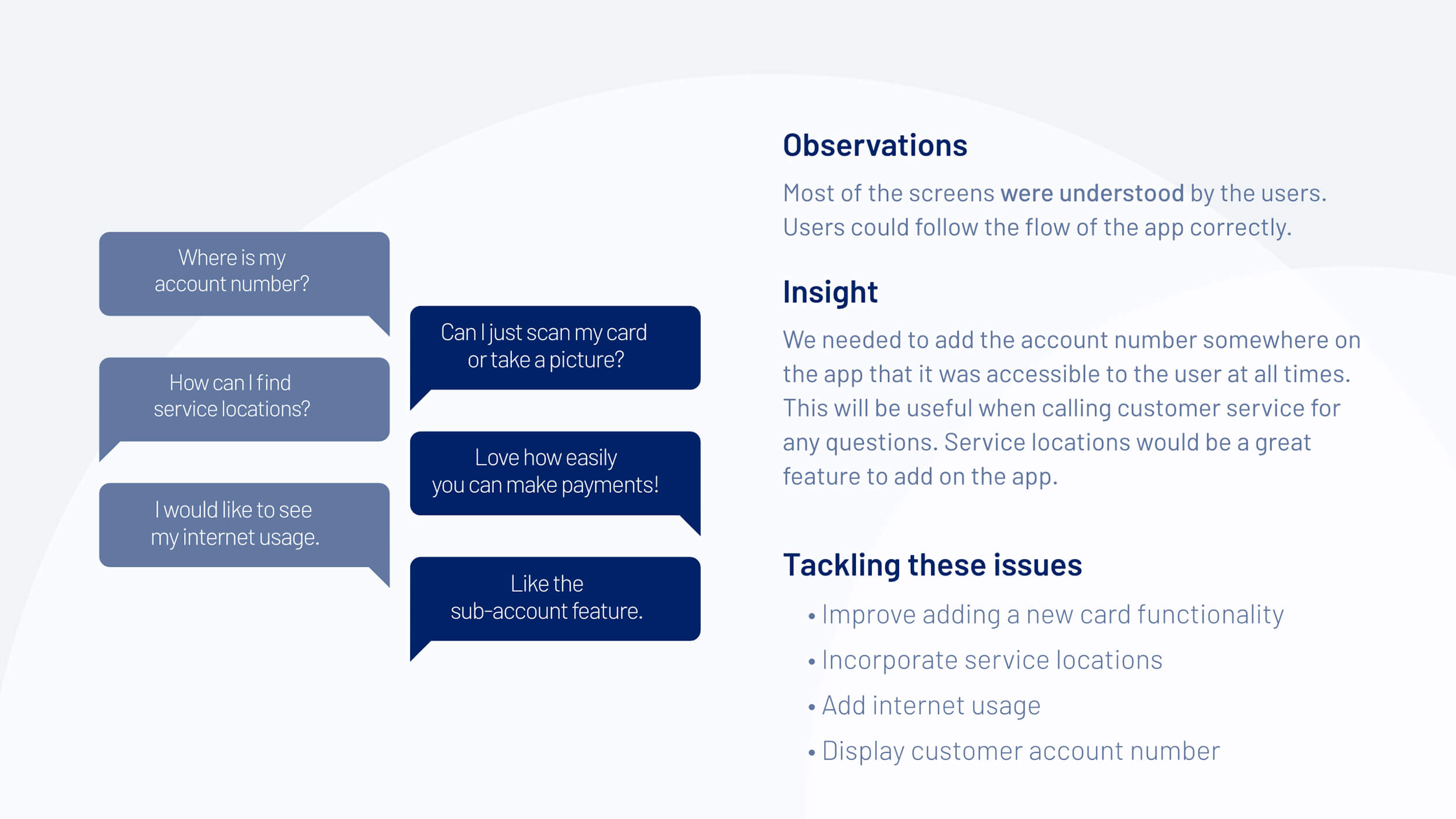
Usability testing showed users understood the app flow, while gaps appeared around quick access to account number, service locations, and internet usage. Users valued payments and sub accounts, which performed well. Improving access to key account details would reduce support calls and help users complete tasks faster.
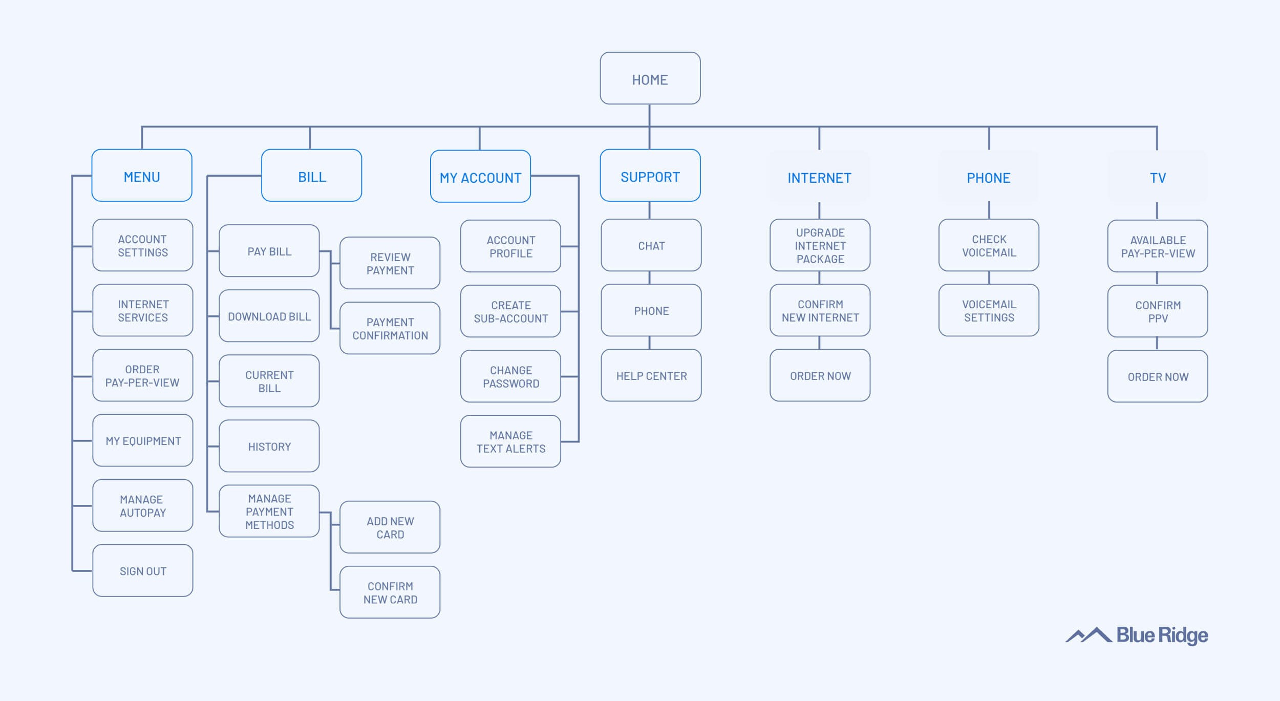
Mobile App Sitemap
The sitemap organized the app around clear user goals, with Home acting as the central hub for billing, account management, support, and services. Primary tasks such as paying a bill, managing the account, and getting help stayed one level deep to reduce friction. This structure helped users move quickly between sections and supported faster task completion with fewer navigation errors.

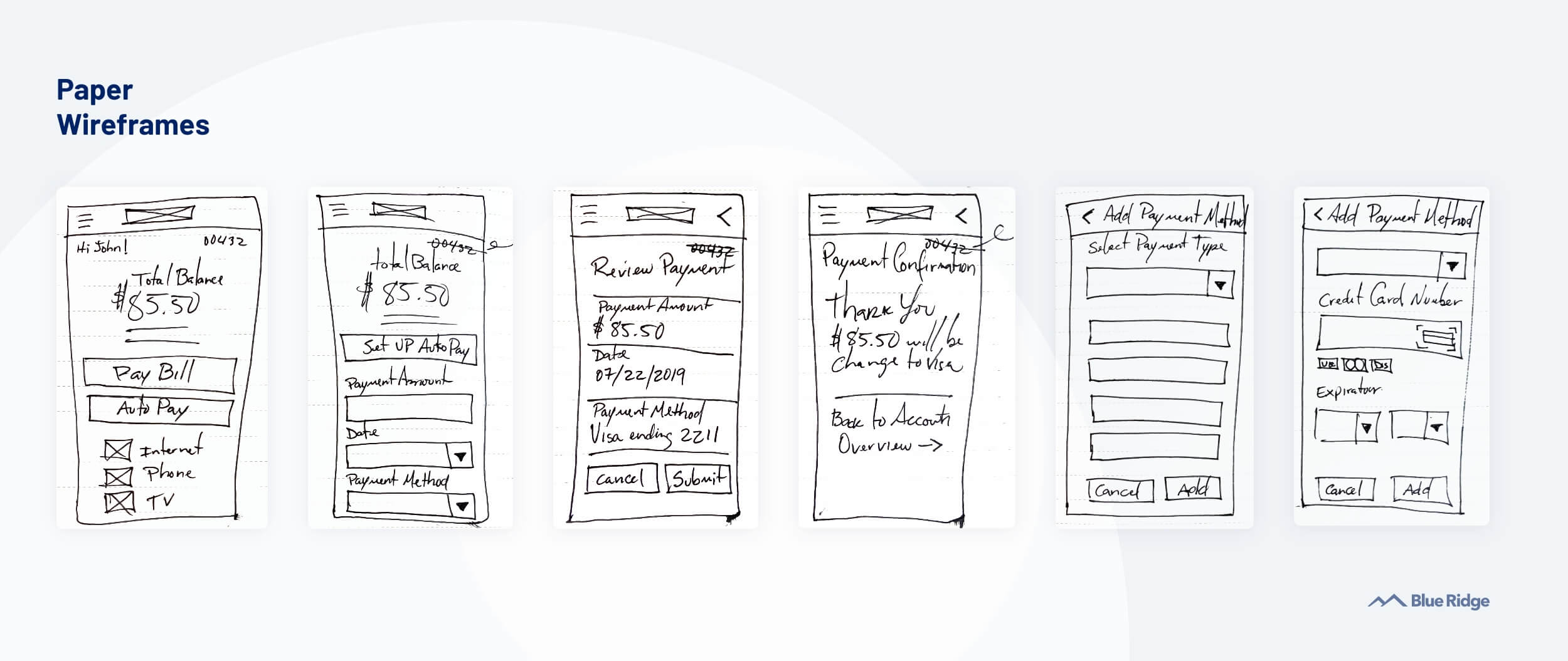
Approach
I focused first on identifying the most common user tasks and failure points using existing data and stakeholder input. From there, I simplified primary flows, reduced unnecessary steps, and restructured information hierarchy to better support quick, repeat usage.
Design decisions emphasized clarity, consistency, and predictability. I iterated closely with engineering to ensure solutions were feasible and aligned with back-end realities.
Key Design Decisions
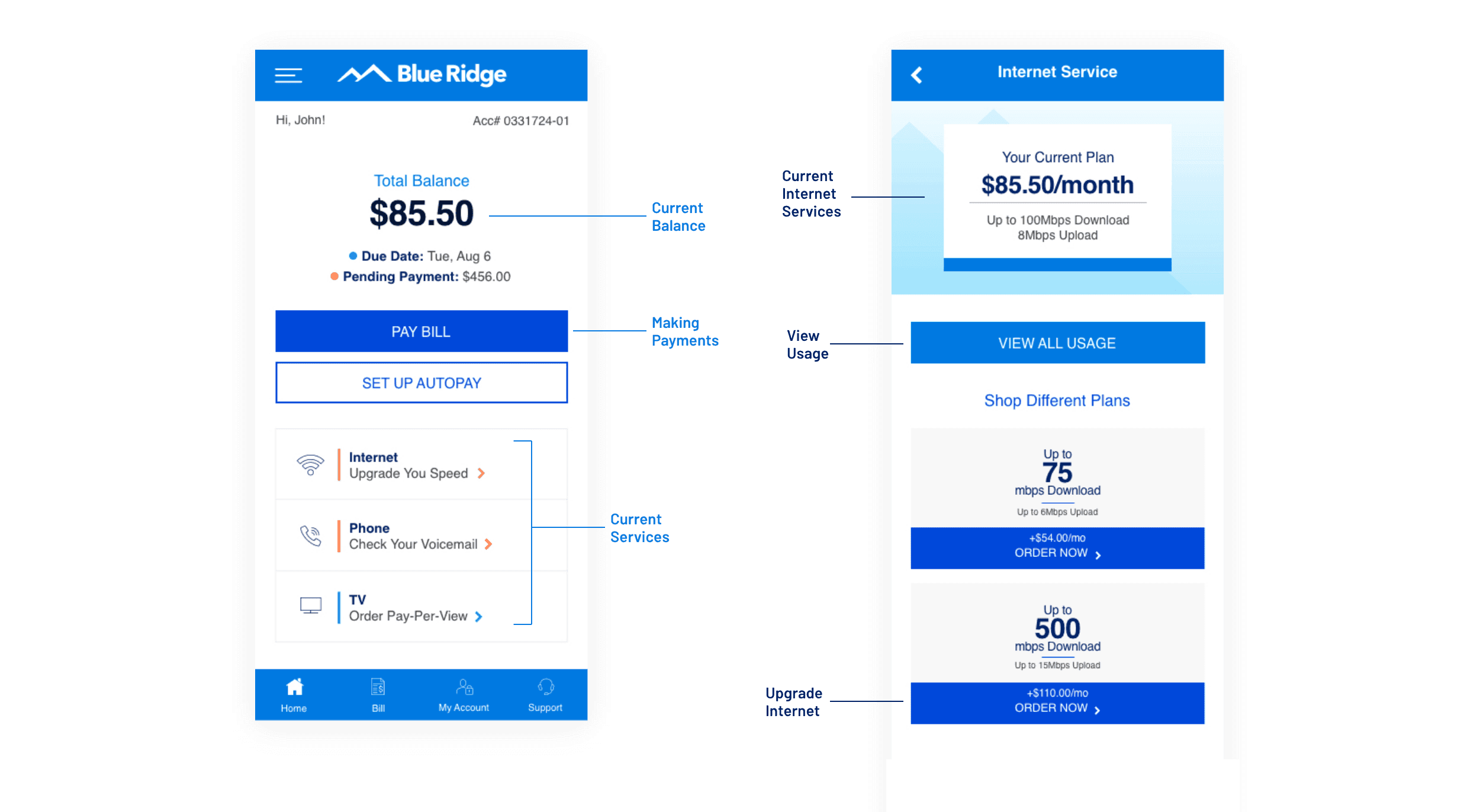
User interviews and A/B testing showed users wanted quick access to balance, payments, and current services on the homepage. We prioritized these elements at the top of the screen and grouped related actions to reduce scanning and decision time. This layout helped users complete core tasks faster while keeping upgrades and usage details easy to find without cluttering the experience.
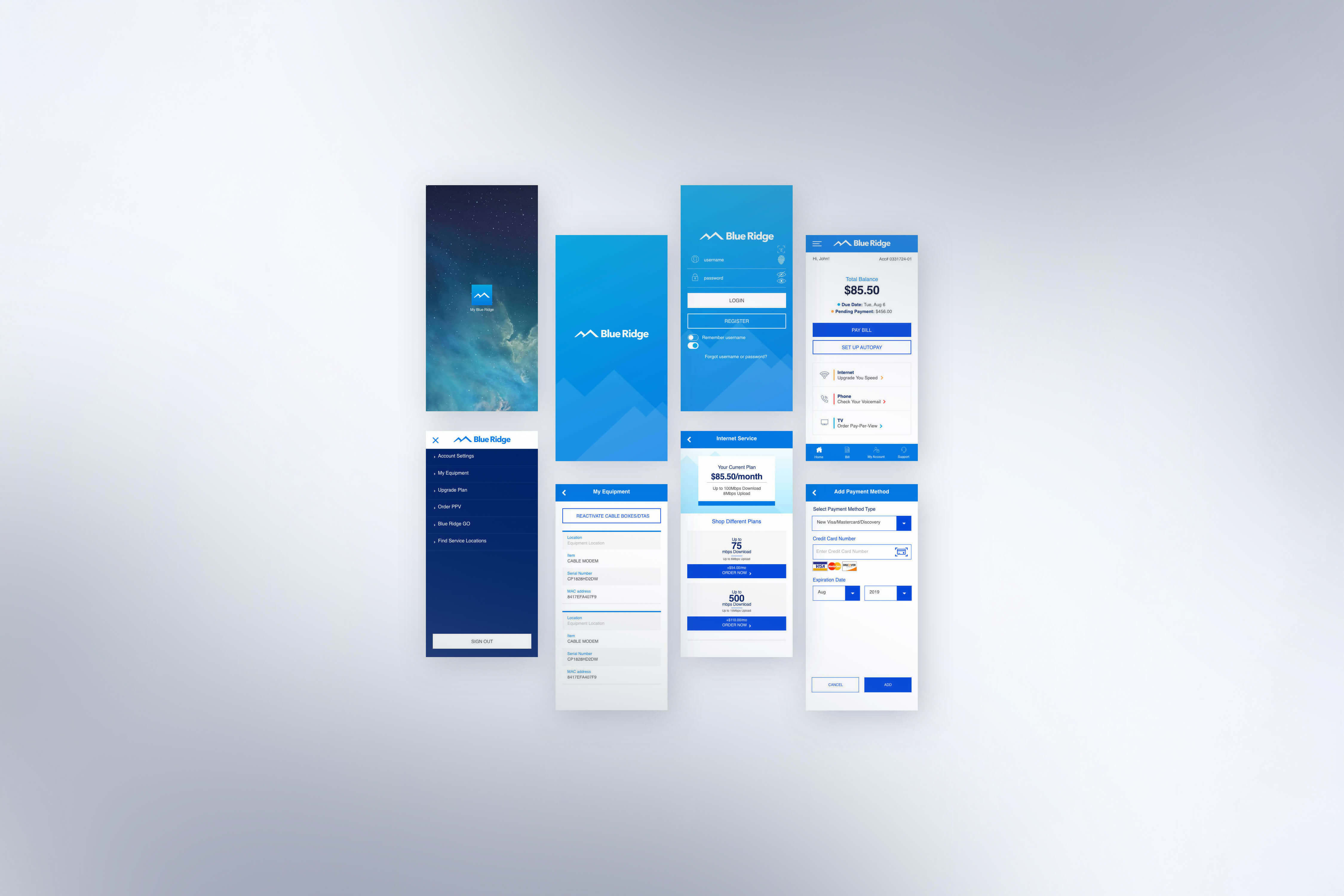
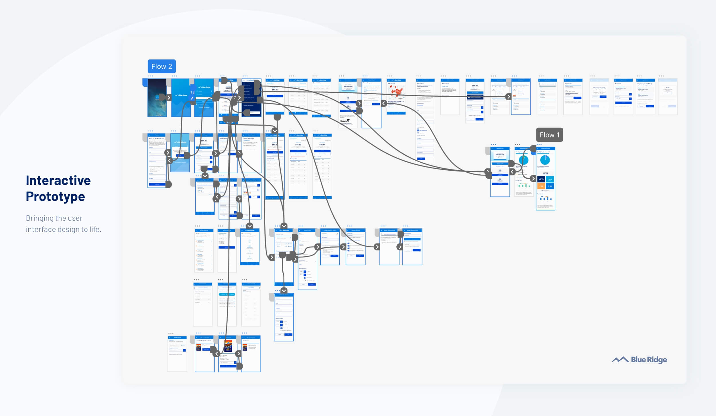
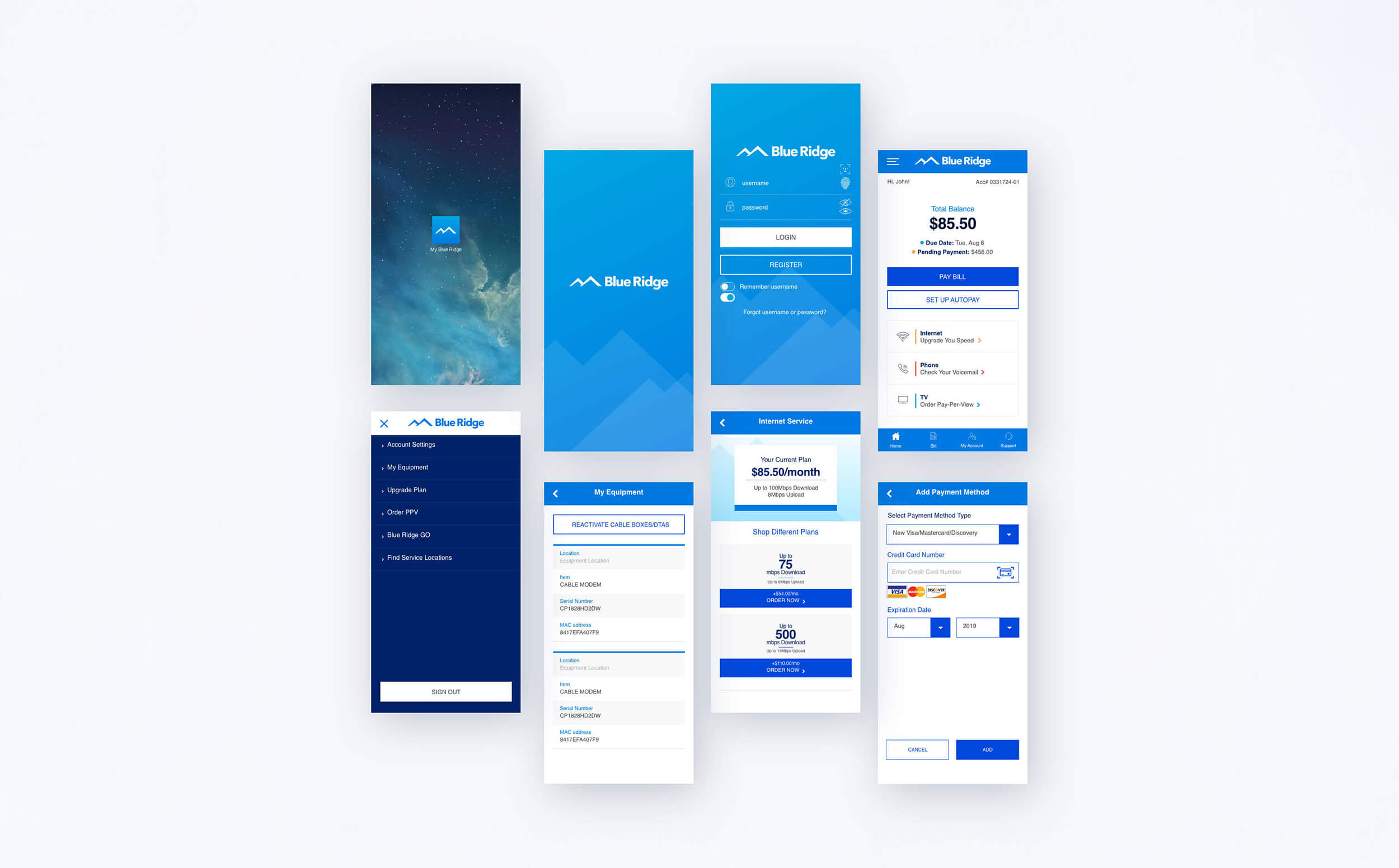
Final Designs
Solution
Task-first navigation
Navigation was redesigned around the most frequent user actions, reducing time spent searching and improving flow efficiency.Simplified account and billing views
Key account and billing information was surfaced earlier in the experience, helping users quickly understand status and take action.Clear mobile hierarchy
Improved typography, spacing, and layout increased scannability and reduced cognitive load across small screens.

Outcomes
The redesigned mobile app improved usability and supported greater adoption of self-service features.
The app reached 10K+ downloads, indicating strong adoption among Blue Ridge customers
Increased completion rates for core tasks such as bill viewing and account management
Reduced friction in primary flows, leading to fewer abandoned actions
Reflection
Mobile design success is driven by task clarity, not feature volume
Small reductions in friction matter most in repeat-use experiences
Designing within technical constraints leads to more reliable products
Credits:
[Designers]
Ruben Cespedes | Dolan Kutzman
[Developers & Scrum Master]
Victor Beltran | Ken Goyak | Tonya S.
[Marketing]
Jason Mastroianni | Emily Massaro