Ruben Cespedes
Menu

Role & Scope
I was responsible for UX strategy, interaction design, and visual design across the BodyMark digital experience. I worked closely with stakeholders to translate brand values into an interactive product experience and collaborated with developers to ensure designs were implemented accurately across devices.
Context & Problem
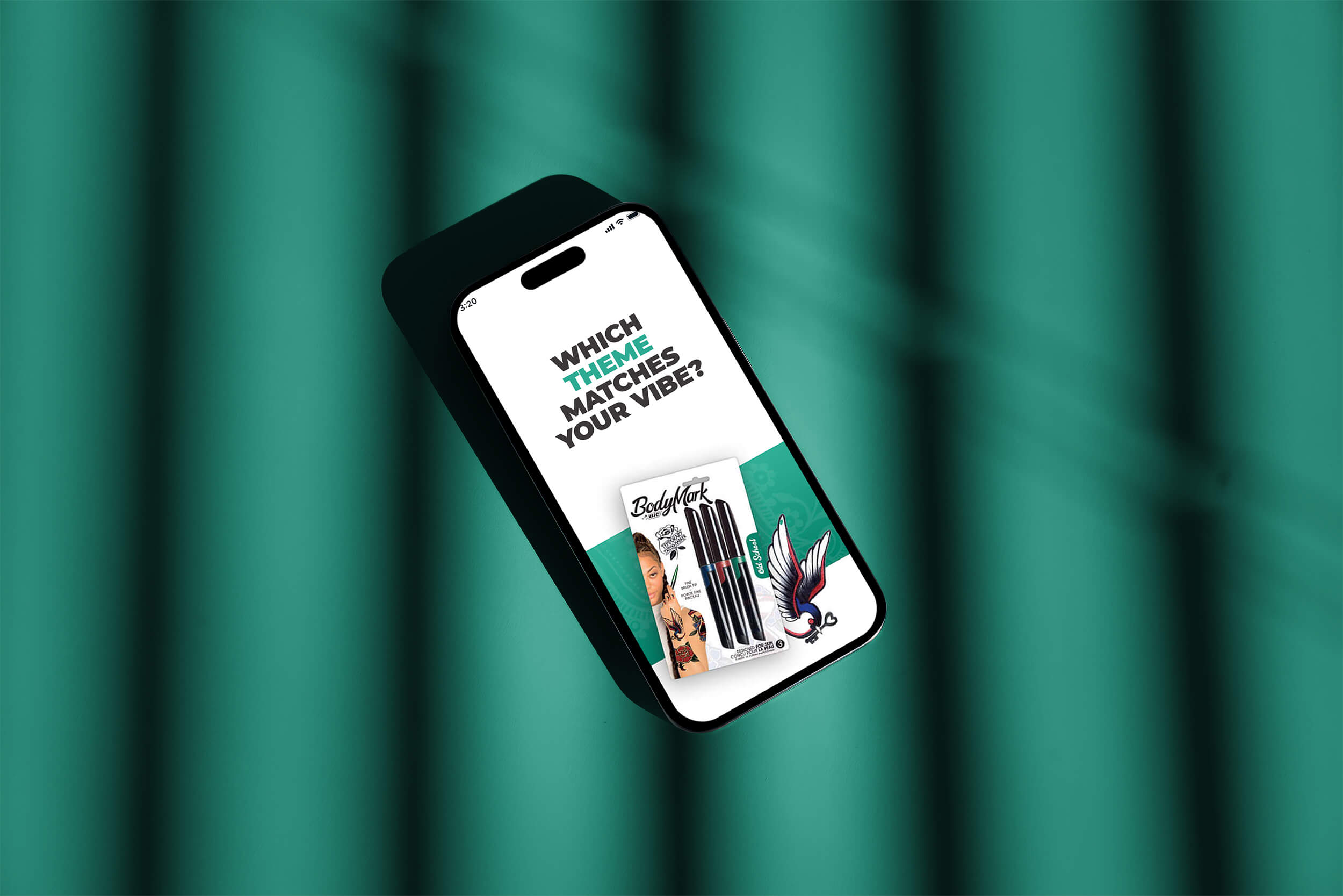
BodyMark was positioned as a fun, expressive product, but its digital presence needed to better reflect that identity. The experience had to balance strong brand expression with usability, while clearly communicating how the product worked and how users could engage with it creatively.
The challenge was to design an experience that felt playful and bold without sacrificing clarity or overwhelming users.
Constraints
A young, creativity-driven audience with high expectations for visual quality
Strong brand guidelines that needed to be respected
The need to clearly explain product usage without instructional overload
Support for multiple devices and screen sizes

Research
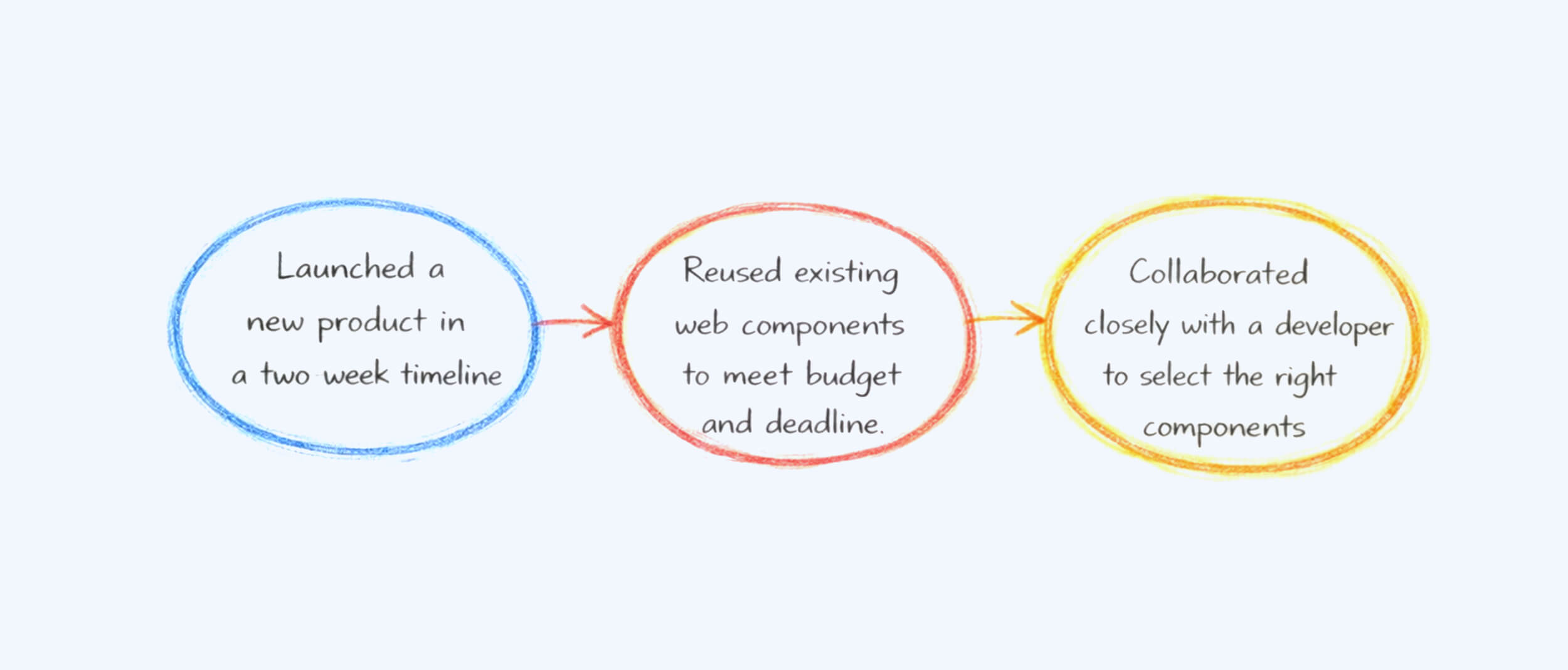
Research happened under a tight two-week timeline, so I moved fast and focused on direct input from real users. I ran five quick 15-minute interviews with Bic customers to understand expectations around product presentation, clarity, and overall experience. I asked targeted questions about what helped them decide to buy, what confused them on similar product pages, and what visual elements built trust. This rapid research gave me clear direction to support fast decisions while aligning the experience with real customer needs.
Key findings from the interviews.
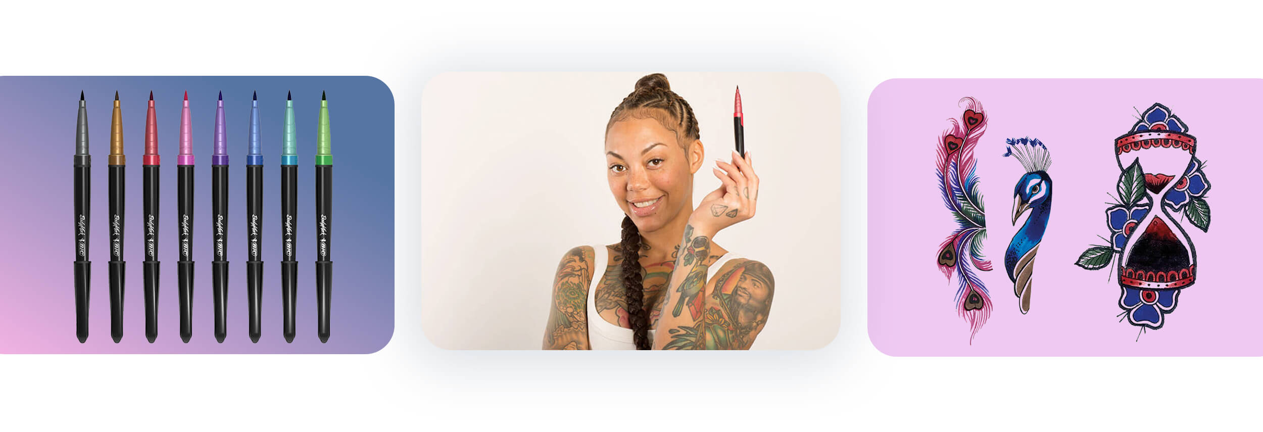
Customers wanted to see the product in use on real skin to judge color payoff, line quality, and intent before reading any copy.
Customers expected simple, scannable content with clear benefits upfront instead of long descriptions.
Customers valued familiar layouts and patterns because familiarity increased confidence and reduced friction during browsing.

Approach
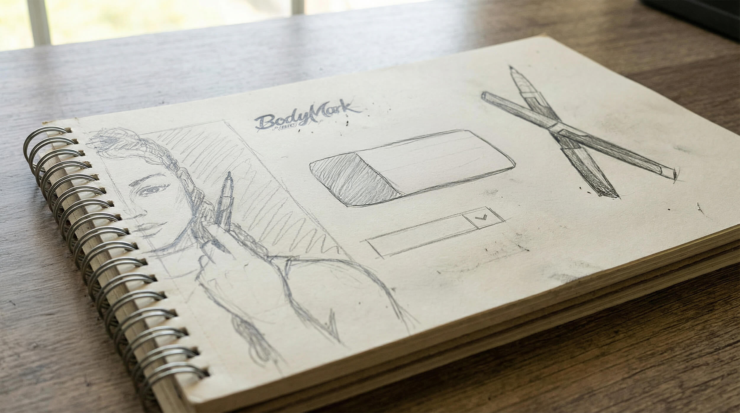
I began by aligning on brand tone, audience expectations, and core product messaging. From there, I explored interaction patterns and visual treatments that encouraged exploration while keeping the experience intuitive.
Design decisions focused on balancing expressive visuals with clear structure. I iterated on layouts, motion, and hierarchy to ensure the experience felt energetic without becoming chaotic, and worked closely with developers to maintain visual fidelity through implementation.
Final Designs
Solution
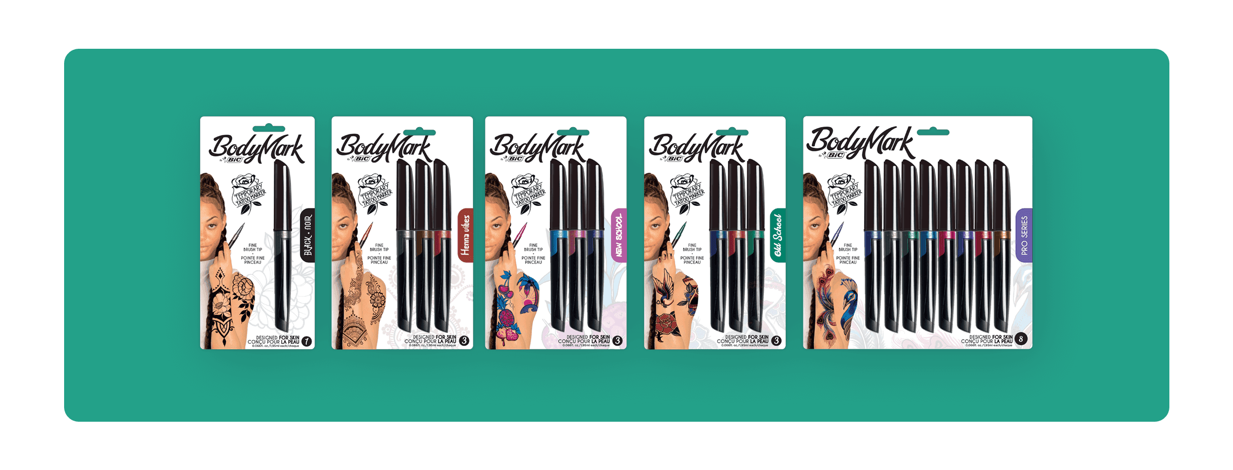
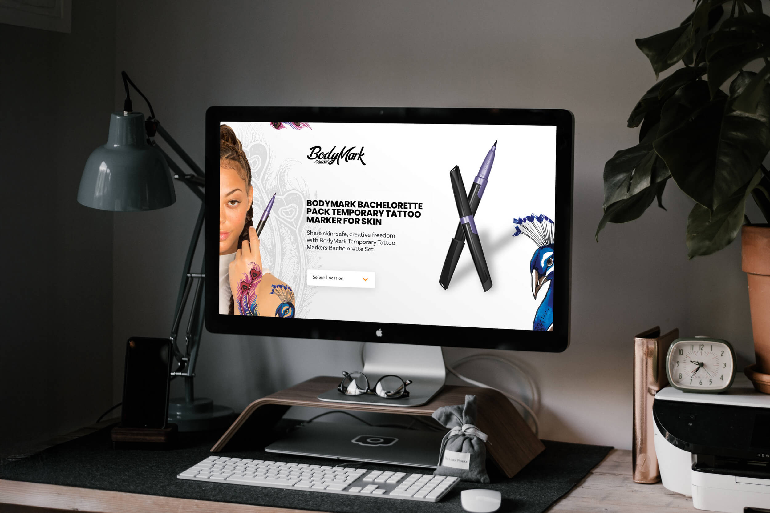
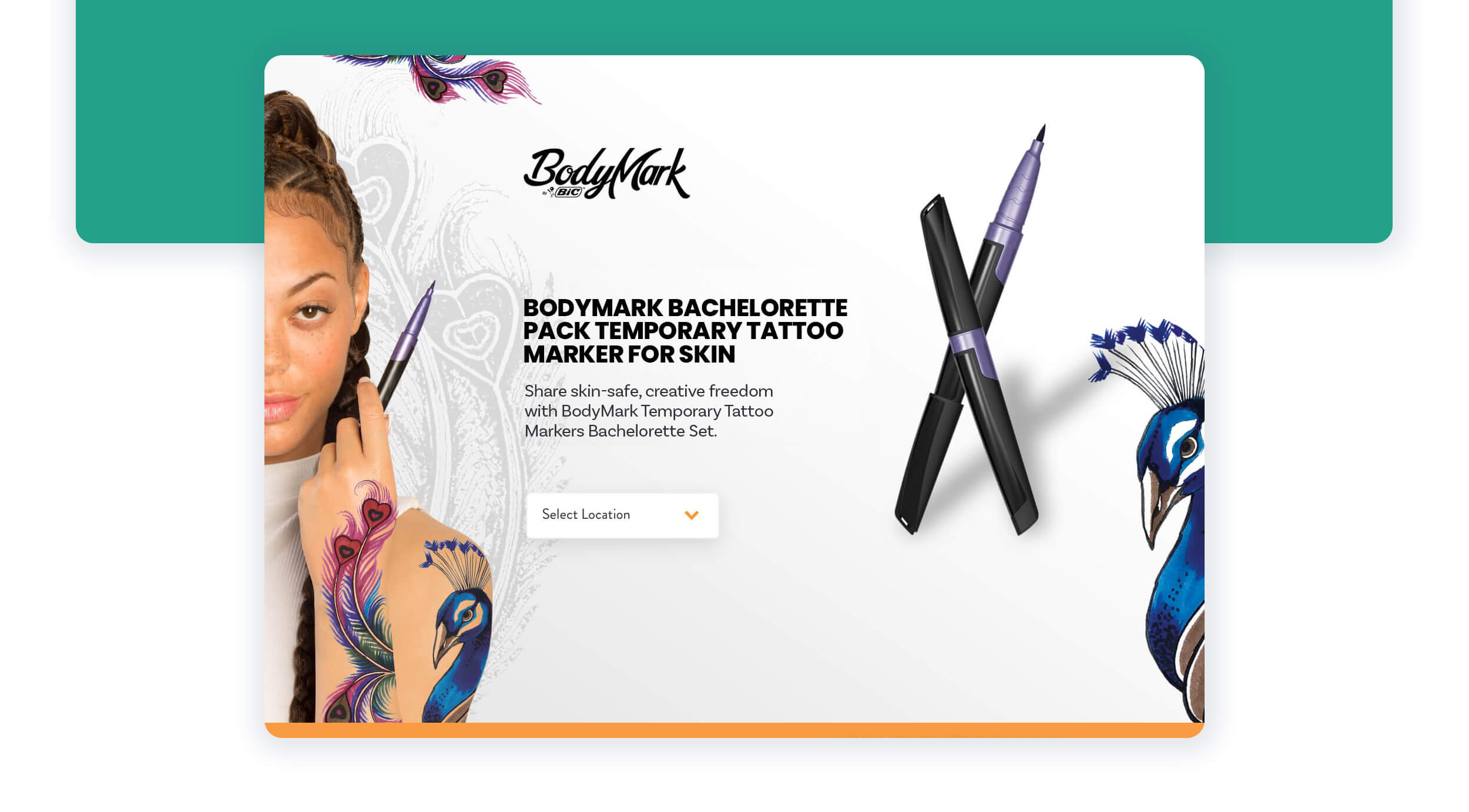
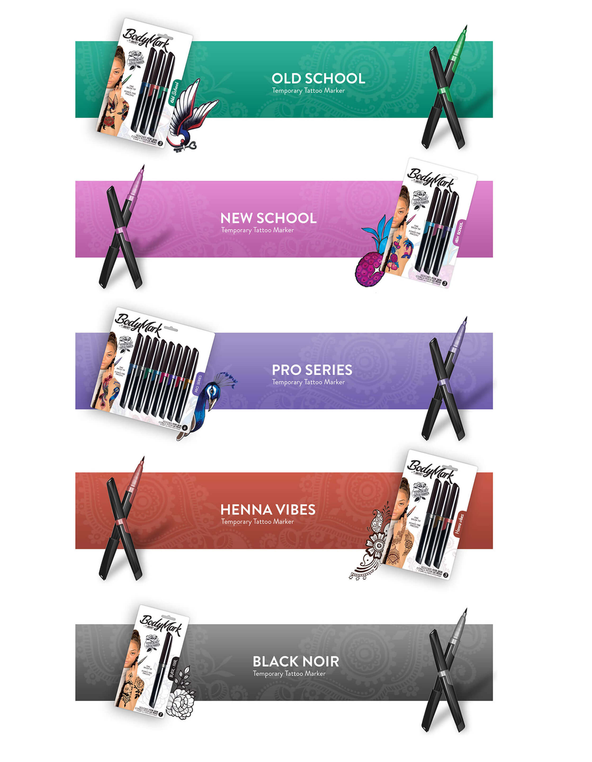
Brand-forward visual language
Color, typography, and layout were used intentionally to reinforce creativity and self-expression while staying true to BIC’s brand standards.Guided exploration
Content and interactions encouraged users to explore product use cases and creative possibilities without forcing a rigid path.Clear product understanding
The experience clearly communicated how BodyMark works, helping users understand the product quickly while keeping the focus on creativity.

Outcomes
The final experience successfully aligned brand expression with usability and helped position BodyMark as a playful, creative product supported by a polished digital presence.
The page supported thousands of purchases within the first week, indicating strong early adoption
67% of total revenue was driven by product detail page sessions, highlighting the effectiveness of the experience in supporting conversion
Reflection
Brand expression and usability must work together, not compete
Designing for younger audiences requires clarity as much as creativity
Strong visual systems help maintain consistency without limiting expression